Tuesday, February 23, 2016

Guest Bedroom Part 1- The floors

The guest bedroom is a room, I have been pintrest-ing and obsessing about for a long long time! I have always wanted to have a home with a kick ass place for friends and family to stay. 

Here is the first night we got the house. (Look at the UGLY carpet)


So obviously that HAD to go the first night, and this is what we were left with. (Sorry this was taken with my cell phone around midnight and after pulling up the upstairs floors)


A few weeks later- after all the nails, staples and tack strip was taken up, and we had sanded down the old finish, our bare floors were beautiful.


The first time we attempted the floors they were really dark. I loved the richness of the floors, and they were really pretty dark.

close up of round one:


Then we got stuck with this patchy disaster, Talked about previously 


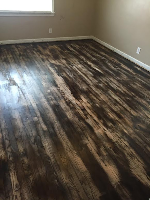
This is the point where we decided to redo the entire process over again, but while we were doing it, we loved the way it looked distressed, and ultimately ended up going with that.

After it was distressed this is what it looked like. There were two coats of stain in the bedroom and office, the contrast is more apparent. (as oppose to the living room where there is only one coat of stain)


Here is a sneak peek of one of the walls in the guest room's wallpaper. Its gonna be awesome


Here is with one coat of polyurethane (it really livens up the space)


Here is the final product with a little painting done. The lighting in the room is just awful, its really hard to appreciate how beautiful this wood really is. We still have some final cleaning up and paint spots to clean up, but you guys get the general idea of this room so far. I also like how much of a difference changing the wall color did to this room.


Here is a close up


This room is going to be one of the last rooms we finish, getting the office set up is a first priority and then hopefully we can move to this room.


I cannot wait to decorate, I have so many ideas and can't wait to get started... Stay tuned!


Thursday, February 18, 2016

Master Part 1 (The egress window)

Here is the listing photo when we first bought the house of our master. Its in the basement and obviously the previous owners used it as an entertainment space. But the reason I posted this picture was to show you the window (covered up by a rocket ship poster) and how small it was. The room also couldn't be listed as a legal  bedroom because of the window. When Carey and I moved in we decided that, putting an egress window down stairs would be a top priority.


2 months later... Our BEAUTIFUL new window. 


It really opens up the room, and the extra light makes the room seem less like a dungeon in a basement. You can also see the patch of the old window to compare size. 


We have a lot of ideas and plans for our master suite downstairs, however we want to complete the upstairs before we start on the downstairs. So there is a lot of work still needed to be done, but for now we are gonna deal with everything being not decorated and unpainted.  Here is what half of master looks like for now


One thing that I might explain is why the placement of the window is so close to the corner. Well, the window previously was about 4 inches away from the steps that go to our patio. Since we wanted to go bigger, it could only go in one direction because of the placement of the steps in the backyard. 


At the end of the day, we are more than happy with the decision to put in a window. Not only to up the value of our house, but for safety reasons as well. It makes the room a little more inviting and once we lighten up the decor and the paint, this room is going to look wonderful. 


Story time!!!


But... as beautiful as this new window was, it was not a great experience. Reader's digest version, the people who installed the window did a few questionable things when cutting into our foundation. The way they did it seemed a little off. When confronted the response we got was "well, I googled it" and "You know we don't do many of them like this".... Not comforting to say the least. 

Might I also mention, these guys acted and seemed like they were the real deal. They came out gave us a quote, told us they could handle the job no problem etc...

After much discussion with them and their complete unprofessional-ism on multiple occasions. We finally asked them to give us a warranty on the work they did. Right after they were finished they were beyond rude (via text I may add... super unprofessional) and apparently Carey had had enough. So Miss Carey Ann decided to pay the egress window their $2,200 in quarters. That is 108 lbs of quarters... It was a glorious win in the Thomas house that day. 


Monday, February 15, 2016

New Kitchen Floors

We have been given the wonderful gift from Care's aunt and uncle, new kitchen floors. They are wonderful people


Myself, Carey, Bonnie and John in McCall Idaho Skiing a few weeks after the floors were finished


I wasn't there for any of the floor remodeling and Care did the photos for me. I realized we didn't have any "before" photos, but I did find the photos that were used when the house was on the Market. I also think that once we get one room completely finished from top to bottom I will show the listing photos and the finished photos. Would be pretty neat to see the transformation. 

Here are the listing photos for the kitchen


The floors are fake wood and in pictures didn't look so bad. However there were a lot of weirdness and  terrible "do-it-yourself" things that were not done correctly or half-assed (for lack of a better phrase) Regardless, here is the before:


Once the fake wood was torn up, they found that there was blue carpet underneath that had a awful old pet smell. The fact that someone would put carpet in the kitchen is crazy enough, but then to be lazy and not pull up the carpet is ridiculous. 


Bye bye stained nasty carpet!


Underneath the carpet was laminate tile, which came up pretty easy until patches of glue needed to be chiseled off by hand. 


Tilley was the foreman on the job


She liked to hang out with John


Here is the slate being laid before grout  


Choosing the color of grout. (Look how pretty the slate is!)


Here is once the floor is grouted 


Here is one with one coat of sealer on


And the final product:


Close up

Here is the transition  from the slate to the floors that will be a future project. The distressed wood and the slate look super sharp next to each other. We are more than happy with the result.


THANKS BONNIE AND JOHN!!!


Until next time!


Saturday, February 13, 2016

Painting day pt 1

Welcome back! Now that the holidays are over, we can get back to working on our house and blog. I have a goal to try and post an update once a week. **fingers crossed**

We got the majority of the painting done in one shot with the help of a couple of buddies. Carey mastered the ceiling and JA and I did the walls. Logan came and did some electrical work for us and then helped out with some trim. We are so grateful that it was a pleasant and quick experience, and we had an awesome crew. Even though we are 6 weeks delayed on the update of the blog, there are still some more painting that needs to be done. (Trim, baseboards, and a couple oops spots) We decided to do the whole house one color since it is small, it will open up the space and keep the flow nicer.

 The original color we started off with was this terrible beige color. (But look how awesome those floors are though!!)


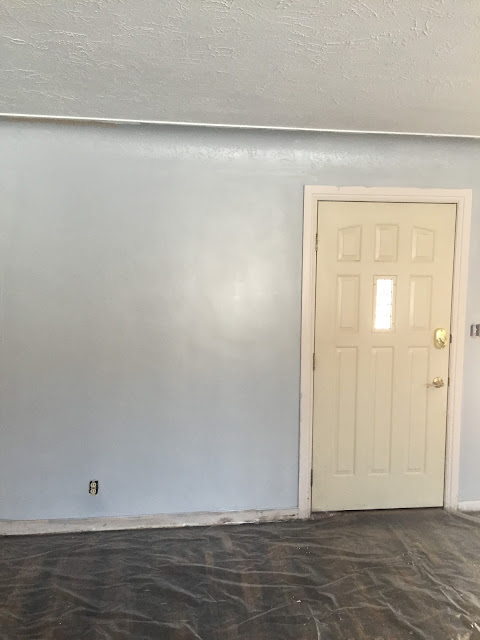
You can see on the below picture the color we ended up going with. Its a grey, however in the lighting in the living room, it looks more like a blue sometimes. Eventually we will get recessed lighting to help open up the space, but for now this is what we have.  We also plastered over many many holes and chips in the previous paint.(Check out the work Logan has cut out for him with the electrical to the left of the fire place)


Care is working on the ceiling, Logan doing electrical and JA cutting in the wall. 


Progress:


Here is one of the walls complete, you can kind of tell here that the top of the wall is actually curved and then comes to a sharp edge. so we brought the ceiling paint down onto the lip of the edge, and I think it really made the transition pop. 


Here is JA working away. This picture shows also how different the paint color looks when the lighting is changed. 


Stay tuned for finishing of the paint, new kitchen floors and some updates to the master down stairs and a few little home projects :)